Making Health
Insurance Accessible.
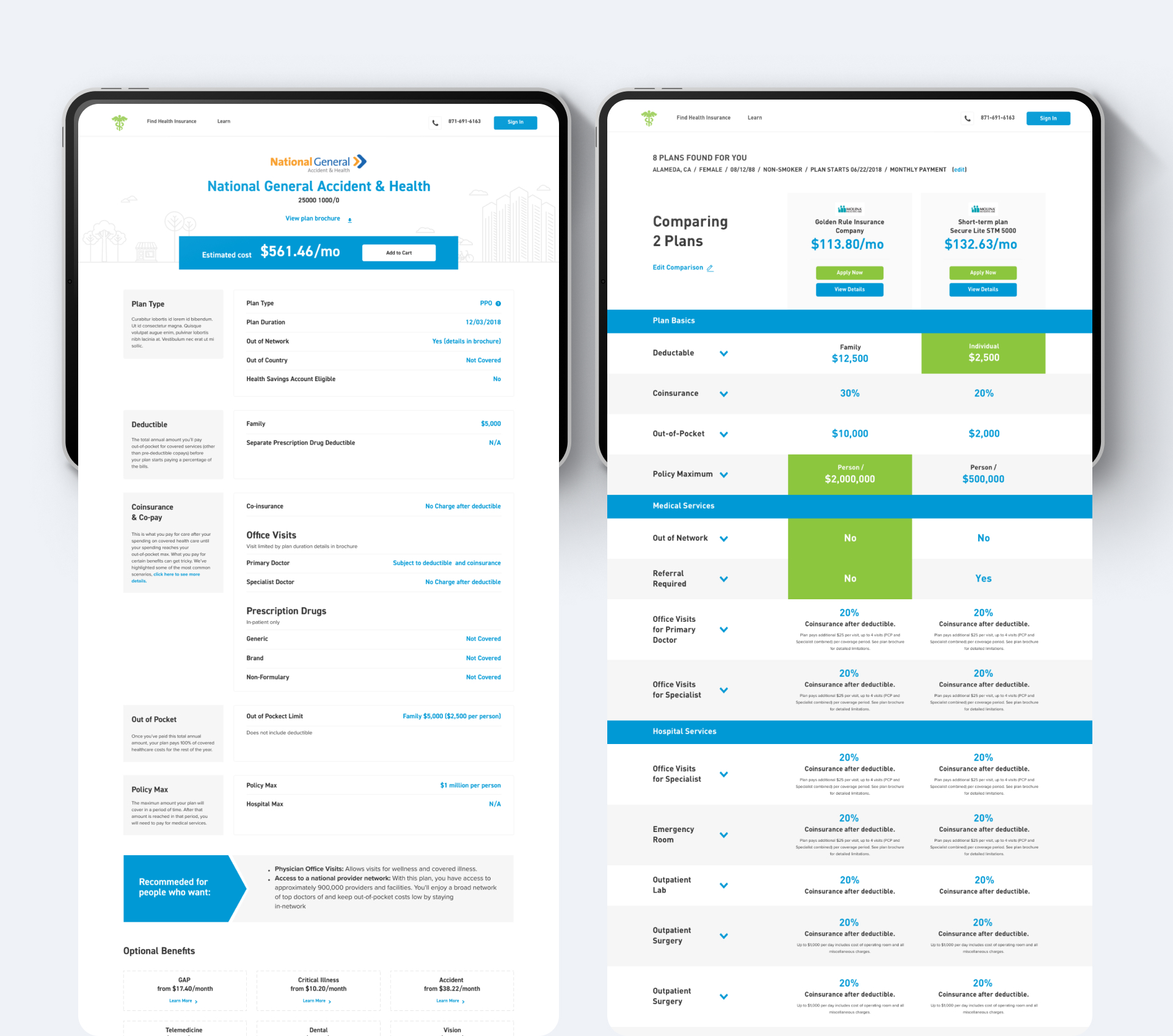
To improve the way data was collected, to improve accessibility, and to create a more contemporary and approachable feel to the platform, we redesigned a responsive comparison website developed for a health insurance company based in the United States.

The previous comparison platform no longer served the business and user needs. Users often ran into issues when attempting to find the information most relevant to potential prospects, often resulting in misunderstandings of vital information.
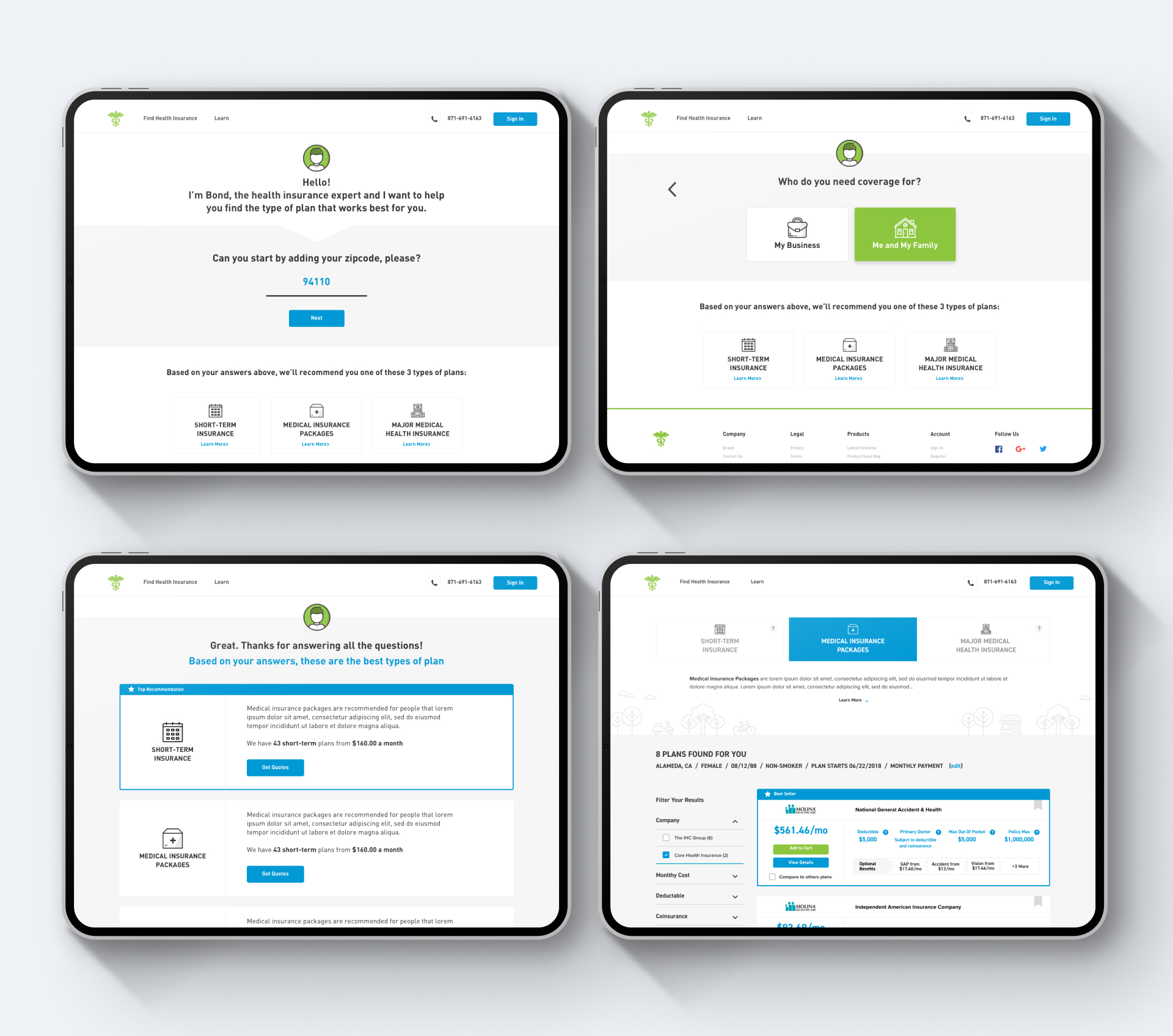
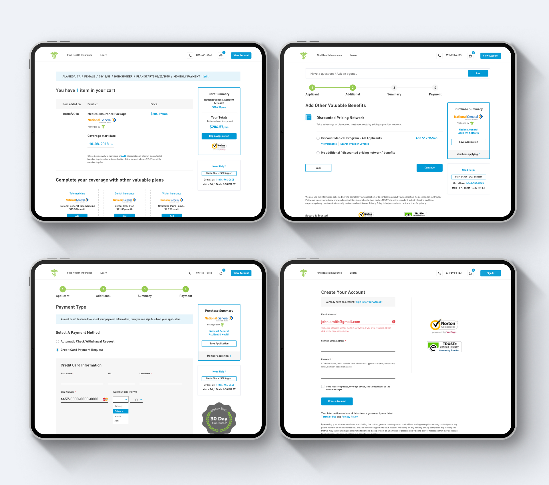
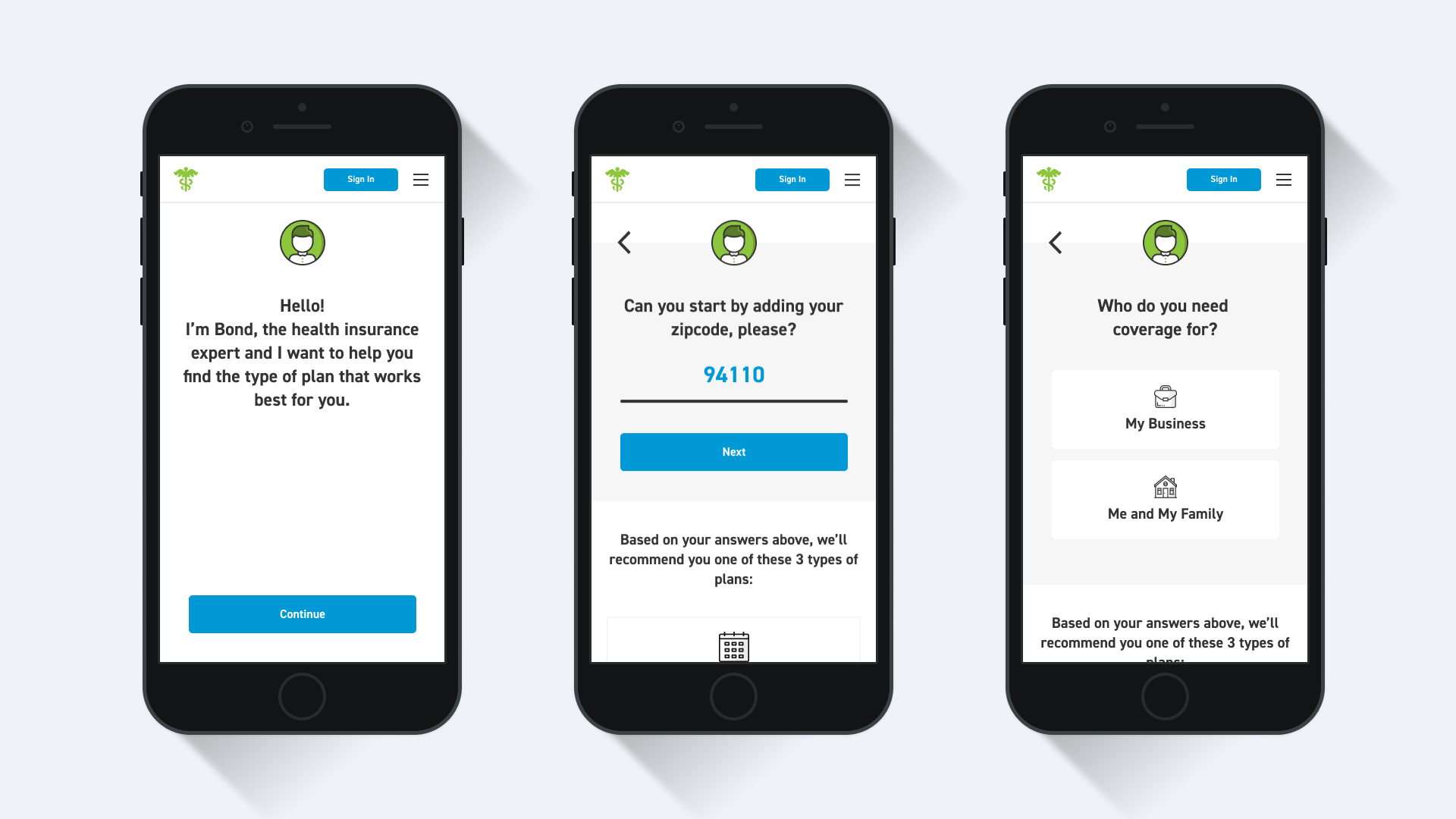
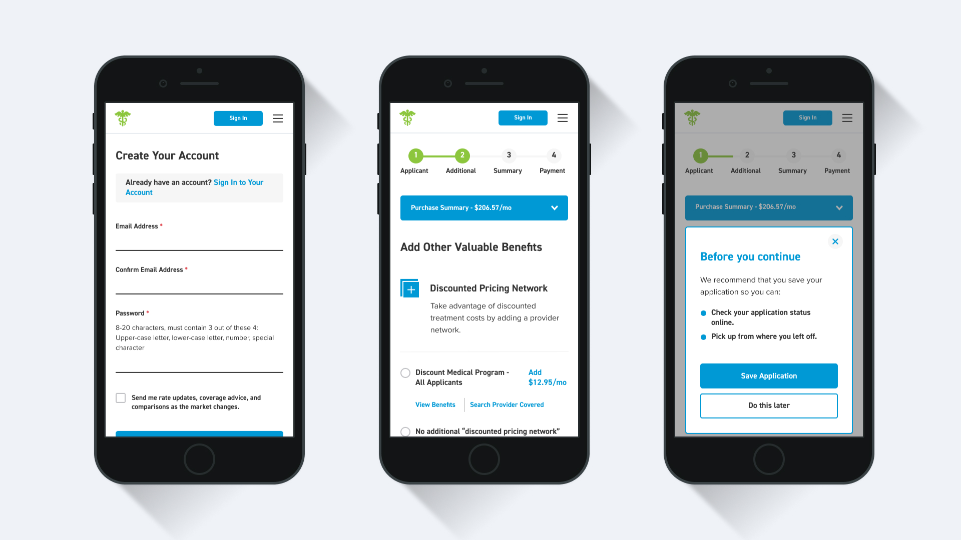
In this redesign, we stripped back the platform to only show what was essential, making navigating through content a more pleasable experience for their users. We introduced more dynamic components and interactive elements that helped better keep potential customers engaged. Working alongside a seasoned UX designer, we reimagined platform questionnaires to be more conversational to provide a more humanistic approach to data collection.